So I have decided to start my brand LIVRID off with a range of t shirt that combine my love of skulls and birds. Mainly focusing on FOWL types of bird such as Pigeon, chicken, goose, swan, turkey. I need to start off drawing out some quick design of the different birds to see if i can combine them with skulls to give it a unique look. I will be printing these designs on to t-shirts my self in my shed so to keep the colours to just black and white should help me design them a lot quick as i wont have to mess around finding the right colours.
This idea has grown from a design I did at the end of level 5 where i drew a bird skull on a bird for a bands poster mock up. I really liked the design and know at some point i would have to develop the idea to see where i can take it and how the imagery can be put to use.
I started out with some designs to see if my ideas would work. And I liked how they looked from the very start. Im still going to work or other designs as i feel i can keep refining these designs to improve them, trace the image or just take the shape, position and build on it or simplify it.
I put beaks on them but with then attached to string so it appears that they are not real just fancy dress like.
I really liked the idea of these designs as i feel they will stand out from the bog standard designs that are done. So i set to work coming up with a few more to be developed, They are to be filled with dot work building up the shading and tones that will give the illustrations so depth fingers crossed.
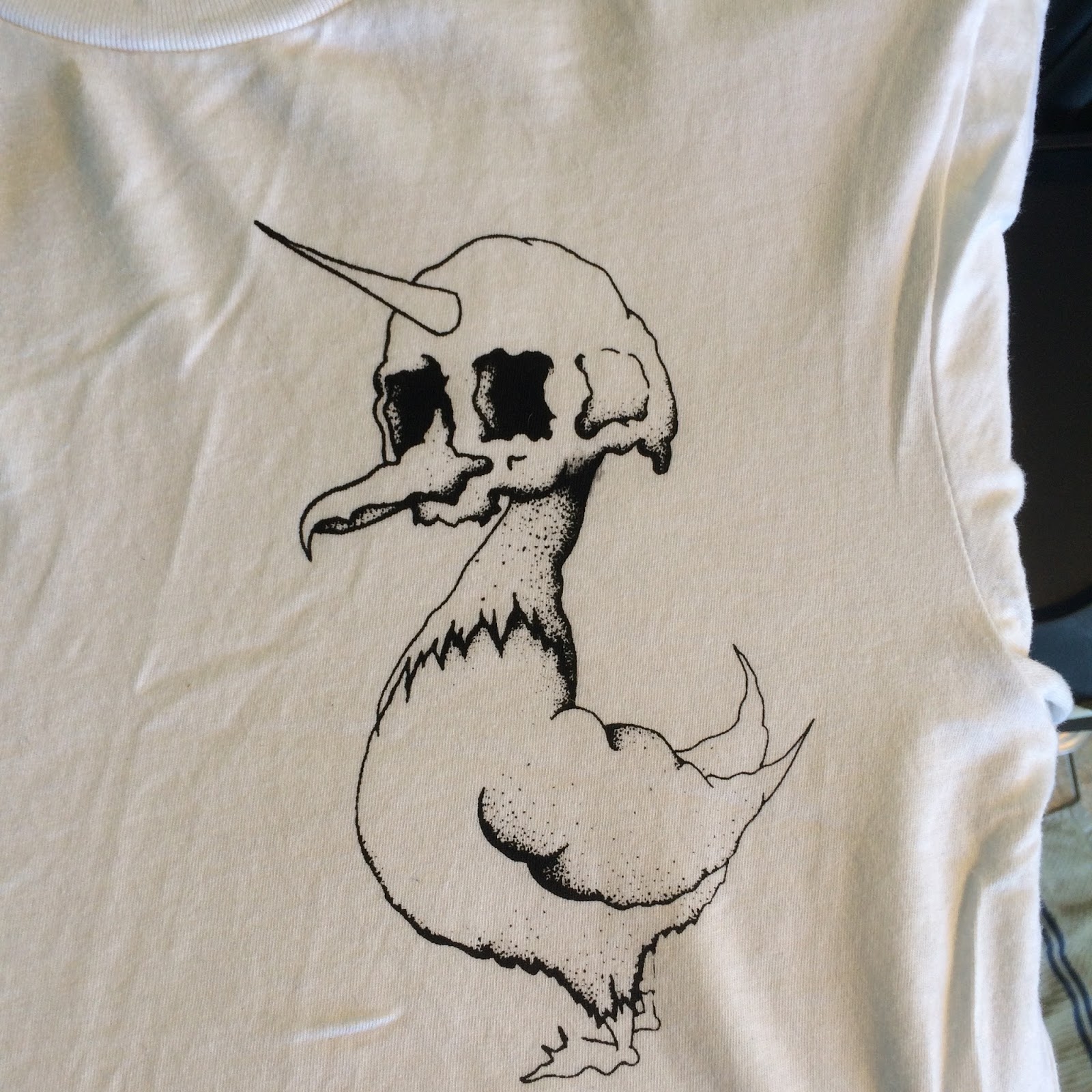
I have just received a order that has some 93gsm thickness paper, with this i'm going to attempt to draw on the paper then try and expose a screen using my 1000w exposure lamp without taking the image anywhere near a computer. Im doing this as im starting to notice the differences to my work once it has been scanned in to Photoshopped and then printed back out. It seems to take something away from my designs. So by taking the drawing straight to the screen it keeps all the detail in the image.
And it worked I don't know if it was just luck but I got this to expose almost to perfection on my first go which was brilliant as I only had 2 screens I could use. I set it to the settings I use to use when using thick tracing paper which is the Lamp set to 21inches and exposed for 16mins, when doing this again on my next set of images in going to expose the screen for 30seconds less just to see if this helps get the really fine detail to expose a little better.

Here is the printed image on a shirt. Im very happy with how it has come out and very happy I got this from drawing to print with NO COMPUTERS input (i'm starting to hate computers again)
This was the second half of the first screen as I like to put at least two designs on a screen this helps with space saving (less Screens) cost and speed of get more then one design out at the same time.
So the next step is to play around with my expose times when exposing the screen just to see if I can get every bit of detail to show. And to finish off the rest of the (try for 4 more plus promo material) designs ready to be applied to shirts.
These are the next designs that i will be attempting to print, I was going to select just one but I have decided that why not do them both. Along with these I will also be putting a design thats off the Fowl subject but its still a flying beast with LIVRID text on. Its a bat hung upside down with a skull pocking out from behind its wrapped up wings. With this one I want to see how the size of the design will look on the shirt as its long and thin im not sure how it will come out. Aswell I will be putting these shirt designs printed on t-shirt on sale on my website, so it will be good to have a variety of designs taht I can see of which sell well and which to improve or scrap all together. The way in which im having to print due to the cost of equipment and what i can afford means im having to try out a different way to usual of printing.

So I set my timer to 15mins to see if this made a massive difference and the results are a little better but i think i will go down another minute again to see if this makes the process and detail better. At 15mins the detail has come thought a little better but still I feel i can get more out of the image once exposed, its just a matter of testing until i go to far under exposing then i can build up the time to hopefully maximize the detail coming through on the screen.
To help me just print the one image I want after covering the rest of the screen with tape I cut out using card the size of the area where the image is. Then I cover the card in parcel tape too and use this to cover the area the image is i dont want to print. The tape helps protct the screen and the product.

Here it is just after I have cleaned the screen down as you can see the water does get to the card after a while but as its just card and parcel tape its not costly and is quick to make a quick replacement if and when needed. . Also with having to angle and move the screen constantly ment I was getting ink everywhere and not realising until I took the t-shirt off the print bend and noticing ink all over the t-shirt off my hands. This method is a area I completely need to change after starting to print again on the t-shirts I started to get ink coming though where the other designs where covered and I had rinsed the screen off it held some ink under the tape and then this came though the screen when I next added pressure to print a shirt. The detail of the other design came out great but it ruined the shirt. In all I have wasted about 8 shirts with me been not been carful when printing and from spilling coffee over two of them. I really need to order more screens so I can have one design on a screen, this will hopefully stop mistakes from having too many designs on te screen.


If I was to use a bigger nibed pen this could help me as i'm using my .25 isograph pen to fill in the shading and detailed areas, A thicker pen would block out more light and maybe be able to translate the detail better, but this could also compromise the overall look of the image i'm looking for making it too bold.

So this is my range so far and now they are all together hung up with added coffee stains on a couple of them just what I needed. This is now starting to look like i wanted it to look but I can also see massive improvements thats could be done to give the overall better results. Such as make all the designs the same size so it looks more professional when all hung up together. The positioning of the image is something I need to be really careful with when producing these shirts, on some of these first samples to be done the positioning of the design is off and when the shirt will be wore the design will sit very close to the armpit of the wearer and not look right. When I next print the next batch of shirts I have worked out that if I follow the edge of the collar down to be level with the bottom part of the sleeve this is about the spot on place place the design wants to be printed. To help me even more Im going to invest in some smaller screen that will fit just one design on and a smaller squeegee so I can better position the screens, as its difficult with the size screens I have now. Getting them into the correct position is difficult which can result in me wasting t-shirts costing me money.
I want to really print on more then just t-shirts such as hoodies, jumpers, prints of the designs, hats these are coming I just need to get some more hours at work to be able to afford the initial costs.
Once this work is submitted I will continue to develop , design and produces this brand as I have had a nice interest in the work I have made so far for this brief. Going forward I want to make the brand start out in the quality of products I produce after seeing what things cost to make a good quality product its where I want to be. I feel that if you provide a product that has been well thought out in the materials used to produce it it shows in the end product. This with the fact with me screen printing the shirts myself I wont have over stocks of designs that don't sell, I can just make whats been ordered, no over spending and products.
Presentation Boards